Serious play.
client
Self.
Background
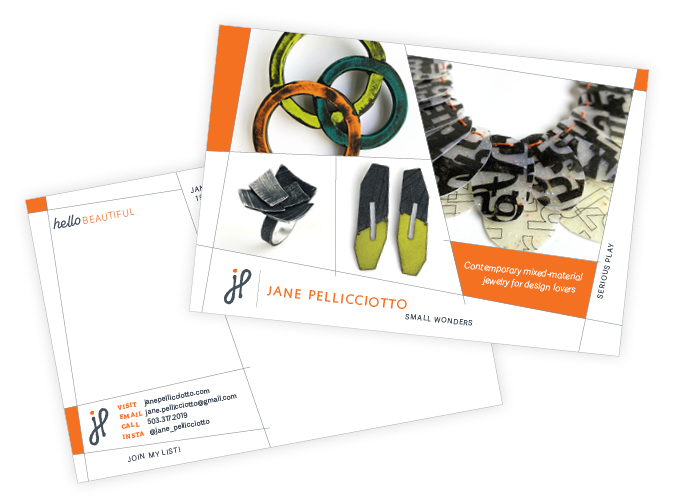
Starting in 2015, I launched a jewelry line that manifests a lifetime of looking at the world and love of working with my hands. The jewelry and the brand reflect the contrasts and contradictions in the world. Can we enjoy color without its opposite? The dark needs the light. Play balances with seriousness. There’s beauty in the ugly, like peeling paint on a wall or scratches on a floor. Sometimes what’s imperfect is perfect just as it is.
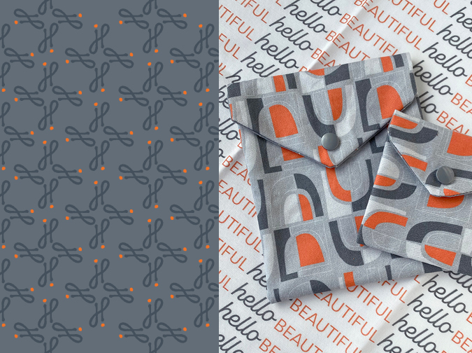
In this brand identity, I try to evoke a sense of the urban environment from where much of the inspiration for the jewelry design comes. The shapes, colors and materials that surround us that often go overlooked. Within those elements are interesting surfaces and angles, the effects of wear and tear from use and the elements, all begging to be translated into a new form…one that’s wearable.
Services
›› Brand identity
›› Packaging design
›› Booth graphics
›› Social media graphics
›› Website design
‹‹ BACK TO PORTFOLIO


Do you have a project like this? Feel free to ask questions or start a project.
